Starting mind mapping quick ideas for the 3 outcomes that are to be produced, one in printing, one painting, one assemblage sculpture. For the painting I want to focus on a style that really appeals to me, so outcomes are going to be completed in an abstract way.
In the afternoon we had a group discussion of sorts giving our own views on the purpose of fine art to each of us personally. It was a mind opening exercise, when answering we all went really deep with our answers
eg. 'Express ideas of importance to the artists making a statement, raising questions in the artist/artwork and the viewer.'
To me its 'communicating my own perceptions of the world to the viewer and giving them an insight in myself as an artist and a person. Both these statements are quite a deep and philosophical way of answering the question but after discussing all our personal interpretations of the purpose of practicing fine art it was pointed out to us that whilst these were good well thought answers, in its simplest form the purpose of practicing fine art is to play around with ideas and have enjoyment and a passion for the work that you do. From the talk one thing that has stuck with me was discussing the power behind art and in the artist and why they have this power of people viewing your work.
14/01/14
We were asked to bring in a piece of fruit, I brought in a banana. As a starting point we were told to give a name to our piece of fruit and to stroke and smell them. This might sound like a ridiculous thing to do on a level 5 course and I did feel silly for doing it but after having a talk with our tutor about the identity and a
function of an object I realised that there was a point to it. The key thing that our discussion was about was 'Metaphorical Poetic Conceptual Language' within assemblage sculpture. Like how within an assemblage there is a relationship between the objects, we were beginning a relationship between ourselves and our pieces of fruit with them becoming our best friends. This was following on from the day before when we were discussing how art is like playing and should be fun, by naming a piece of fruit and giving them the standing of being our best friends it was like entering into a childlike state of mind when you would name your toys and play with them. That afternoon we drew our fruit but not capturing the image of the fruit, furst we used mark making to draw the texture of the fruit, what our pieces of fruit would sound like if they had a voice of their own, the smell of the fruit. Each of these drawings was proved by our tutor to be as valid as a drawing of our fruit as if we had drawn them as we saw them then the drawing would be a lie as it is taking a 3 dimensional object and recreating it on a 2 dimensional plane. Lastly we answered a series of questions from the viewpoint of our fruit best friends further developing a personality for the fruit and deepening our symbiotic relationship.

15/01/14
 In college round the back a lot of stuff has been thrown away by the college so upon suggestion by our tutor we decided as a group to go have a look and source some interesting objects. I collected a wide variety of objects that I wouldn't have been able to get anywhere else other than from the colleges own little dumping ground. I didn't want to just dump all the objects in my space and leave it at that so I started playing around with them and arranging them in a couple of different ways and I made a bus stop out of them.
16/01/14
Visit to the Portico Library & Gallery and Manchester City Art Gallery.
20/01/14
Visit to Yorkshire Sculpture Park.
21/01/14
 Following on from our talk with Robin the week before we had a slight recap on Metaphorical Poetic Conceptual Language. He drew an light bulb on the board and asked us what it was, obviously the response he got was it's a light bulb. He went on to say that we were wrong for calling it a light bulb as a light bulb is a 3 dimensional object with a function which is to light up to dark areas. On the board it was in fact a drawing of a light bulb. Robin told us about Rene Magritte who did a painting of a pipe on which he wrote 'Ceci n'est pas une pipe,' this translates as 'This is not a pipe.'
 In the afternoon we began to play around with our collected objects and construct them into assemblage sculpture pieces, taking into consideration similarities and differences between some objects and just placing other objects and seeing if they worked with the sculpture and taking them away if they didn't. When I first began I wasn't giving much thought to a concept behind the sculpture such as my ruined bus stop as pictured here on the left. In the morning discussion we spoke briefly about Archimedes who noticed that water is displaced when an object is submerged and the word he shouted upon his discovery was 'Eureka!' Similarly we were playing around with objects arranging them in different ways to see if we had a light bulb moment and suddenly had a direction to go in.
 My light bulb moment came to when I arranged my objects in a way that looked something like a ramp, I then maneuvered my desk chair onto my topless table but instead of having it stood upright on the table I brought it slightly forward so that it was teetering on the edge. To prevent it from totally falling off onto the floor I used a plank of wood to keep it balanced. And there was my concept, balance. Following on from a route I shortly ventured down during the mark making project were I looked at a balance between calm and chaos, but in the end the balance was lost and chaos overrode the calm. For this project I wanted to keep the balance in place and venture down keeping the balance in perfect in harmony. After we had constructed our pieces as a group we went around giving our views on each others work, one view that came up about my sculpture was that it looked like there was movement within it which had then been stopped by the plank of wood. This got me thinking of another route I could go down with my assemblage piece as opposed to balance.
22/01/14
 When it came to printing outcome I was at a bit of a loose end on were to begin. So I started by looking at my assemblage sculpture and enlarging certain sections of it in the form of mono-printing. I produced 3 prints in total 1 worked better than the other 2. One of my less successful prints didn't have enough ink on the sheet when I did so looks really faint and the other that didn't work as well had too much ink as I wanted to try rubbing my hand lightly over the paper so that there was an impression of ink all over the sheet then drawing bold darker line for my objects, this didn't work out to well and it is difficult to pick out where the lines that I drew in are. My successful print had a nice balance of ink on the sheet of thin plastic accompanied with the pressure I applied both with my hands and the pencil and within this print are varied tones.
23/01/14

 I had been think about what had been said about my sculpture piece looking as though movement had been paused within it, I wanted to take this concept of movement but look into pausing movement as I had done previously with the plank of wood as to me some pieces of artwork ones that are capturing the image of what is in front of the artist is almost like pausing the moment they are seeing, trapping what is going on in that single second where the brush touches the canvas in stasis preserving the moment in art forever. I wanted to do a similar thing but with a 3 dimensional object as opposed to being on a flat 2 dimensional plane. I deconstructed then reconstructed my assemblage sculpture with the thought of movement and stasis in my mind so whereas before I arrived at my end point through play this time I was working with purpose. I wanted there to be movement within my sculpture but also a way for me to stop the movement. I balanced the chair upside down so that the wheels where on top and could be spun freely, on these I placed the table upside down with the legs in the air so at least there was something that I could use to create the movement. I kept all of this within my space in front of a piece of green metal framework which acted as a kind of frame. Whilst my sculpture could move freely from where I looked at it it was all contained within this framework but when I introduced the plank of wood to stop all movement from happening the plank of wood went beyond the edges of the frame sort of like breaking out of the 'canvas' that I had created my work as even though it is a 3 dimensional piece it was still up against the wall much like a flat canvas.
27/01/14
Visit to Prospect Studios & Printmaking workshop with Alan.
(Me, Charlotte, Alan, Chloe, Georgia, Calum)
 After re-discussing with Robin about my assemblage piece and refreshing him on where I stood and what I was looking at, I began by de-constructing the desk chair and removing the actual seat part and just leaving myself with the mechanism of the chair and the wheels. As I am looking at movement and pausing movement this is the part of the chair that I need to retain. I enjoyed myself whilst de-constructing the chair even though most of the screws were incredibly rusty and it was a physical strain to get it to come apart, when I eventually got the mechanism away from the chair I felt accomplished. I took the wheels out of the base so that I could change the parts to create a bigger propeller out of planks of wood. I took the arms of the chair and added them back into my sculpture but facing the other way round. With the arms of the chair the height can be adjusted and each time it is changed there is a clicking noise, the arms click 7 times before returning to their lowest height. After 6 clicks the wheel base catches on the top of the arm rest and gradually comes to a halt, and after 7 clicks the wheel base won't spin at all.
 Following on from the printmaking workshop that we took part in as a group on Monday. I used the same plate that I had made whilst at the studios and followed on from one particular print that I had created. My favourite print from the workshop contained both positive and negative space and it was the element of the negative space that I wanted to implement in my future prints. For two prints I blocked out the face of the Mona Lisa, for two others I blocked out the entire figure and for my final two I only printed the figure. Unfortunately the plate I was using to get a print from doesn't last forever and the amount that I was getting to print was diminishing slowly and the prints were getting fainter and fainter. Only the prints where I had blocked out the face worked really well for me to work back into by adding in an abstract pattern to the negative space. For my printing and painting outcome I am looking into icons and idols so I took the Mona Lisa to use as a starting point because it is a very iconic piece of artwork.
These are images of the other prints I did experimenting with creating negative space in different aspects of the print. I tried creating negative space around the figure so that was the only thing that showed up. I liked how this work and it opened up the chance for the possibility for me to create my own background without being restricted to what I had carved into the plate.
After this I played around with just printing the background as opposed to the figure, even though this didn't give me the opportunities to do my own thing in the negative space like with the previous two prints as the outline of the figure can be seen. Unfortunately these prints is when it become apparent that the plate doesn't last forever as these are my faintest prints.
30/01/14
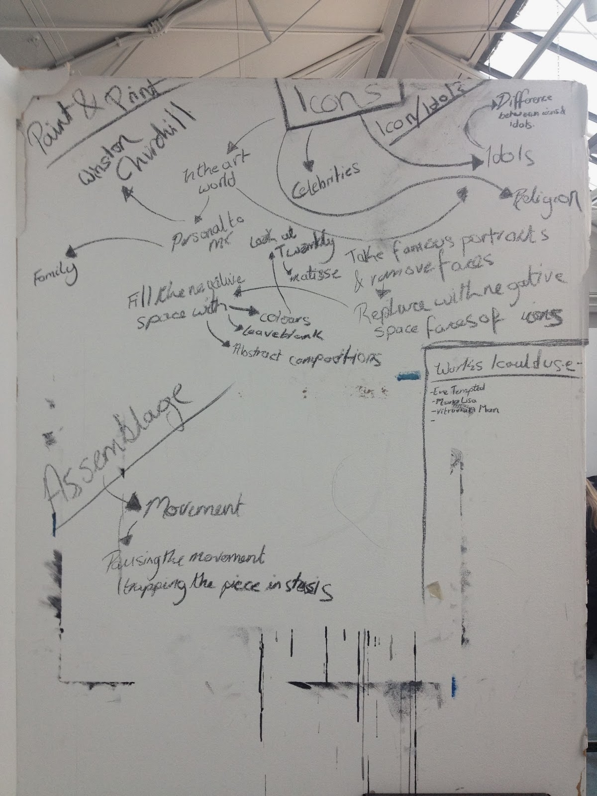
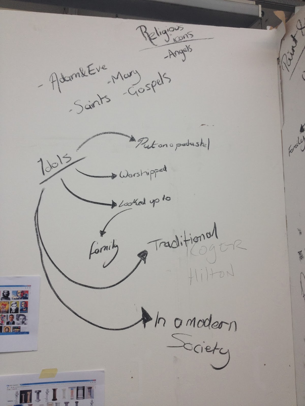
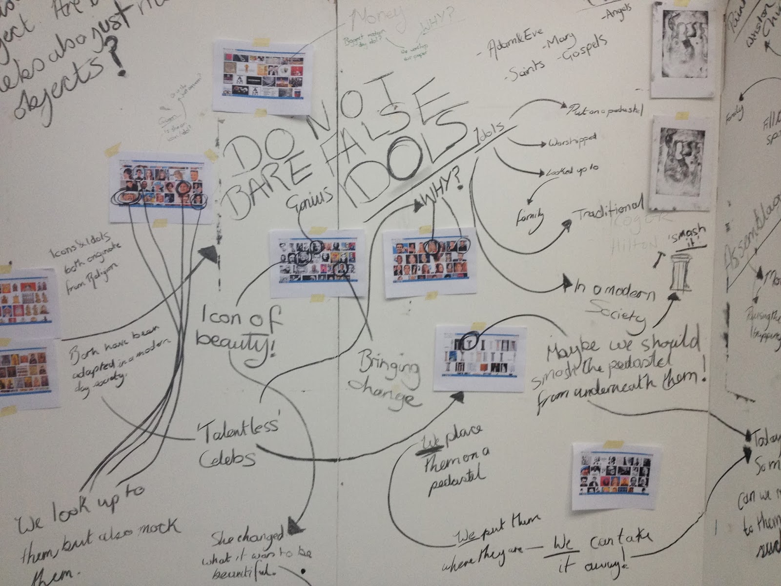
My painting and printmaking work for this project is centred around icons and idols, both the origin of these terms with me looking into religion and modern day icons and idols such as; celebrities and family members. My prints that I have done so far all link with this as the central image in each of them is the Mona Lisa which is an iconic piece of artwork in my personal opinion. I began brainstorming a few quick ideas and keywords to get mind thinking about what direction I could go down with this theme of icons and idols.
03/02/14
Over the weekend I sourced some images of screenshots of my google images so that I had a wide range of images to work with to carry on with brainstorming my ideas.
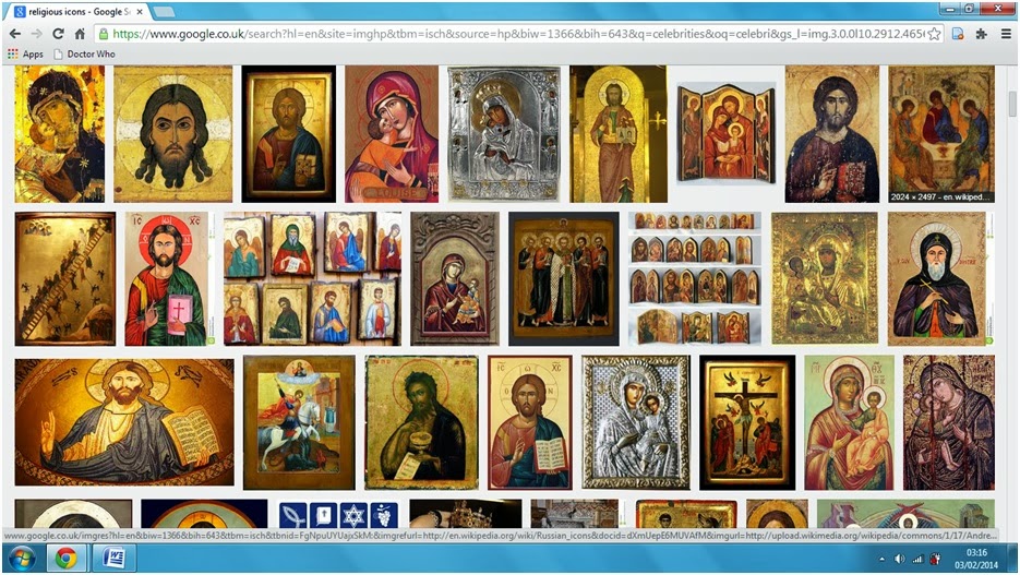 The point behind using screenshots as opposed to a selection of images was so that I could implement the smaller thumbnail images into my mind map that would be taking shape on my boards.
Over the course of the day I added into my mind map with new ideas and thoughts that came to me. It's now a little bit cluttered with words with still relatively easy to follow and to see how I got from one thought to another. In the afternoon I sourced some more imagery of celebrities and religious icons and idols but instead of screenshots of my google searches I gathered a variety of images to use in my work, iconic celebrities in my opinion and some celebrities who I feel shouldn't be in a place where they are looked up to, religious imagery and to add to my mind map I screenshot google searches of technology and brand logos to play around with the idea that in a modern world these are always present in our lives and in a way they are idolised by us in that people want the newest technology and clothes by a specific brand and things like that.
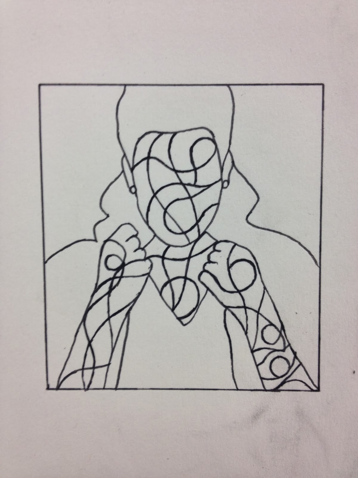
 I'd seen an image of an abstract piece of work that was just shapes filled with colour with a black outline around each shape, this was something I wanted to try but with the inclusion of an image on top of the coloured shapes. First I used the image of a celebrity I consider iconic, followed by a celebrity who I think is anything but and a Tiki idol. I experimented with adding into both the background and the image itself.
04/02/14
I worked on a way of fixing my assemblage piece to the plinth I had it sitting on so that as I rotated the propellers the structure wouldn't wobble and topple off the plinth as it had done several times already. Fixing it down became even more crucial after I had attached the first propeller onto it as the change in weight dragged it down on one side. The balancing issue will be fixed when all five propellers have been secured onto it but so far finding materials suitable has been difficult. I had a plastic casing off of a light as one of my propellers but when it was drilled the surrounding plastic cracked and shattered so I won't be able to use that.
 One of my propellers is going to made of two sliders out of a filing cabinet but as of yet they haven't been attached on as they need to be attached together first, I think I'll be having them welded together I spoke to my dad about the process and he knows someone who may be willing to do it for me.
 Yellow ink had been known to take an exceptionally long time to dry in the past and in this case a lot of time is something that I most definitely do not have as I will be having six layers in this print, all primary and secondary colours as these were the colours I stuck to in my first compositions that I did in my sketchbook. As the yellow takes a while to dry I decided to move my prints down to the studio as at the time it was really warm in there and I had a heater that I could aim at the prints to speed up the drying process, Charlotte helped me to first blot the prints to take off any excess ink before transporting them down to the studio and then sticking them up on my board so that I could see all my prints side by side together.
 I also worked back into my two prints of the Mona Lisa with the negative space contained within the face, I only used red, blue, yellow and white acrylic and kept my colour palette strictly to primary and secondary colours and tonal variations of these. Even though these pieces of work are essentially the same I do prefer the one that is on top in the image as I feel like the composition of the shapes fit better into the face in that print than in the other one.
 Now that I had my two sliders fixed together with a piece of metal attached underneath and bolted to each slider I fixed it onto my sculpture temporarily as where I need to drill a hole in it to attach it on properly sit two plastic wheels that will need to be removed beforehand.
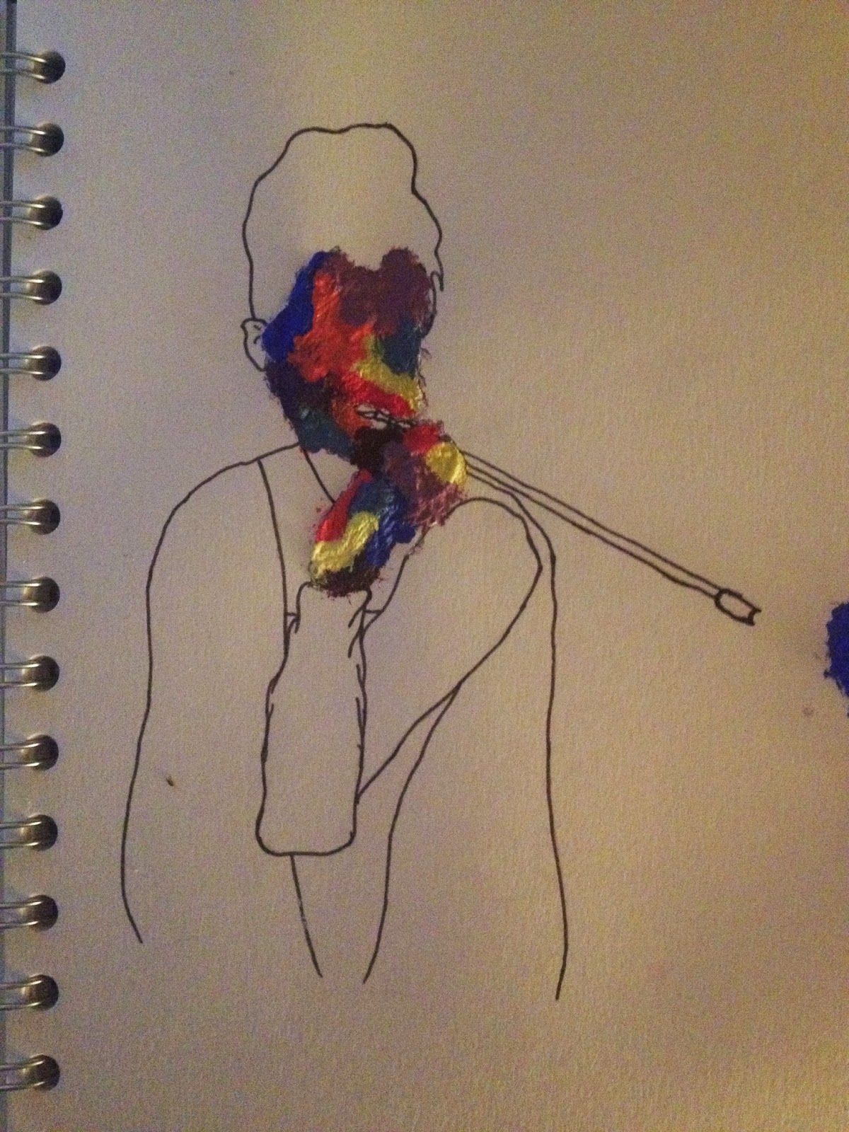
 I'd had seen an image on the internet of a painted face which a build up a colour in the face similar to what I have been doing but whereas I had been painting shapes whoever did this piece of work had just layered paint over and over creating a texture and this gave me another idea which immediately went on my mind map. Then I tried it out, using the image of Audrey Hepburn I did a quick sketchy outline in charcoal leaving out all facial features then filling this in with layers of paint, leaving it to dry then layering it up with more paint to create texture. I used acrylic paint to create the texture but I also want to try this with oil paints.
12/02/14
It had been a week since I did the yellow layer of my print and the ink was now completely dry so naturally it was time for me to print the next layer over the top, I chose to go with the colour orange as I figured that this was the next easiest colour for me to print over. Repeating my process and adding white after three prints I finally started to quite like my print as there was now shapes within it albeit only a few as this was just the second layer but it was starting to take shape now. After printing all twenty-four I cleaned off my lino and cut out the shapes that I wanted to remain orange so that my piece of lino was ready for when I would be printing the next layer.
17/02/14
Visit to Walker Art Gallery & Liverpool Tate.
18/02/14
Talk with Gary.
An audio visual artist came in to talk to us about the work that he has done and exhibitions that he has done. The talk with him was very interesting and looking at his work was really interesting too as it was a style of work that I hadn't really seen before. Gary worked with electronics and modifying devices such as game consoles so that they could be connected to an instrument and then the notes played on the instrument would cause a particular visual to appear on a screen. He spoke briefly about how they went about setting up their own exhibitions but didn't go too into detail about the nitty gritty side of getting permission to do things such as the exhibition that they set up in Wigan North Western train station however I think Bex has the details of the girl who Gary worked with for these events and as a group we spoke about getting her to come in and talk to us. She now works for a curator and wanting to be a curator myself one day I would really like to talk to her about how she started and what steps she took to get to where she is now.
20/02/14
For my third layer of my print I used green but it was too dark to use immediately so I added white to it before I even started, after adding white the hue looked more like a secondary green than it did before which I was pleased with and then I repeated my process again for this layer.
24/02/14
 I started to experiment with oil paints as opposed to acrylics as when I was at the Walker I had seen a piece of work, 'Aelous' which had layers and layers of paint built up creating a texture something I wanted to capture in my work. I worked with layering up the paint in the image of Marilyn Monroe another icon had chosen to use. It was difficult to build up a thick texture this way as the oil paint takes time in order to dry, when I tried this with acrylic the colours began to blend together and became dirty whereas with the slower drying oil paint the various colours didn't blend together and each brush stroke stands out above the stroke below it. Along with this I also wanted to experiment with breaking the boundaries of being trapped in the confined space of the face with big sweeping brush strokes, again with oil paint but this time thinned out quite radically with white spirit. The image of Audrey Hepburn's head on a pedestal was lost as I layered up the paint but by just applying white spirit the paint started to come away from certain areas, I did this but only over her eyes because I didn't want the entire image of her head to be lost just faded away under all the paint with a small percentage still peering through.
25/02/14
With this project drawing to a close I spent today finishing off my assemblage sculpture attaching the last of the propellers to it. Originally I had been using the metal that was used to attach the wheels to the base to slot through each of my modified propeller arms but I was unable to remove them. However when searching for materials to use for my last propeller arms I came across an old table that I had picked up that had small pieces of wood attaching the sides to the legs. Fortunately for me these small pieces of wood where almost the same width as the metal parts I was originally going to use and roughly the same length so they worked perfectly. My two final propellers utilised the remainder of the table, two of the sides were attached together to make up one propeller arms and the final one used one side of the table and was attached to a leg from the same table. Now I had a sort of handle on my piece so that I can turn and build up momentum to come away from it and be confident that it will keep spinning for some time. Beforehand when I was pushing it from the end of one of the arms often the piece buckled from the force or the arm would slide off of where it was meant to be sat.
26/02/14
For our end of year show we want to exhibit using the space at Cross Streets Studio in Standish, so naturally it makes sense to visit the space to get a feel for it and to have a look at what is available to us. In the space there was a few different spaces on offer to us, wall space, enclosed space even a space that would allow us to have a video as our exhibition piece.
After having a look around the space downstairs, Jane who had come to college to talk to us previously led us up to the studios, I was astounded by how big the upstairs of the building was as from the outside it's deceptively small. There were a variety of artists in the studio when we got there and we had the opportunity to speak to all of them in turn and have a look at work they had completed or were currently working on. Seeing each of their individual areas where they work was great as that was a working studio, but there was a homely feel to it, some of them even had comfortable chairs in there. It really did look like a home away from home which is what an art studio should be. Speaking to the artists was great, each of them have their own individual styles that they work in and were all more than happy to share ideas and give advice to us. Visits like these really help to build up my confidence as I'm usually quite a shy person but the personalities of these artists brought me out of my shell as they engage us to ask them questions and ask us questions too.
27/02/14
 With my assemblage piece completed I wanted to move forward with my painting and printmaking. I had the idea to repeat the image of an icon over and over again to the point were it no longer has any significance and the word 'icon' literally loses it definition and just becomes nothing. I wanted to represent this visually both with paint and print. When I was experimenting with painting styles I completed a painting of Audrey Hepburn with a bright vibrant colour background, I wanted to replicate this in print so I decided to do a lino print, the same size as the painting and then I would add the figure in later. Unfortunately due to the time I only had time to print the red layer on and had to leave my prints to dry. I was still experimenting with different painting techniques, I returned to using acrylics and the image of Marilyn Monroe missing all her facial features except for her lips. I was still playing around with the idea of creating texture with the paint only this time I rigorously dried after applying each layer and I stuck to the primary colours.
28/02/14
My prints were still a bit wet so I couldn't cut them down and mount them up in the compositions when I first got to college so I left them and carried on experimenting with paint. I used plaster this time in order to create texture, applying it first to a figure I had created myself combining elements of the Mona Lisa with Audrey Hepburn. As I had done with most of my studies so far I only applied plaster to exposed flesh as that is where I would be painting.
 I also returned to the idea of using a religious symbol as my focus point, I chose the Egyptian key for this, being an icon of ancient Egypt it was a nice contrast from the figurative icons I had focused on for the majority of this project. With this one I built up a relatively thick layer of plaster to paint over as I had the space within this piece of work to do so.
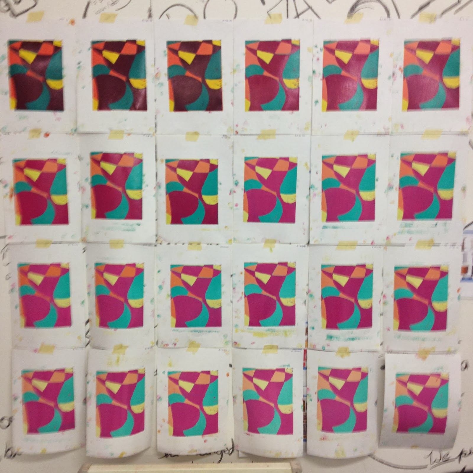
 After this I returned to my prints which were considerably drier now and began to cut them down with the guillotine, I wanted to present them in the same way Andy Warhol had his twenty five Marilyn's, completely side by side and top to bottom without any white gaps. I used three sheets of A2 paper for this fixing eight prints to each sheet in two rows of four. I then stuck each of these sheets up on board underneath each other so when I was done it was six rows of four. I kept the prints in the same order throughout as when I originally printed the yellow layer, after every third print the hue would get the slightest bit lighter. I am really happy with how my prints turned out in the end and I really like the way in which I chose to present them.
28/01/14
 After re-discussing with Robin about my assemblage piece and refreshing him on where I stood and what I was looking at, I began by de-constructing the desk chair and removing the actual seat part and just leaving myself with the mechanism of the chair and the wheels. As I am looking at movement and pausing movement this is the part of the chair that I need to retain. I enjoyed myself whilst de-constructing the chair even though most of the screws were incredibly rusty and it was a physical strain to get it to come apart, when I eventually got the mechanism away from the chair I felt accomplished. I took the wheels out of the base so that I could change the parts to create a bigger propeller out of planks of wood. I took the arms of the chair and added them back into my sculpture but facing the other way round. With the arms of the chair the height can be adjusted and each time it is changed there is a clicking noise, the arms click 7 times before returning to their lowest height. After 6 clicks the wheel base catches on the top of the arm rest and gradually comes to a halt, and after 7 clicks the wheel base won't spin at all.
29/01/14
 Following on from the printmaking workshop that we took part in as a group on Monday. I used the same plate that I had made whilst at the studios and followed on from one particular print that I had created. My favourite print from the workshop contained both positive and negative space and it was the element of the negative space that I wanted to implement in my future prints. For two prints I blocked out the face of the Mona Lisa, for two others I blocked out the entire figure and for my final two I only printed the figure. Unfortunately the plate I was using to get a print from doesn't last forever and the amount that I was getting to print was diminishing slowly and the prints were getting fainter and fainter. Only the prints where I had blocked out the face worked really well for me to work back into by adding in an abstract pattern to the negative space. For my printing and painting outcome I am looking into icons and idols so I took the Mona Lisa to use as a starting point because it is a very iconic piece of artwork.
These are images of the other prints I did experimenting with creating negative space in different aspects of the print. I tried creating negative space around the figure so that was the only thing that showed up. I liked how this work and it opened up the chance for the possibility for me to create my own background without being restricted to what I had carved into the plate.
After this I played around with just printing the background as opposed to the figure, even though this didn't give me the opportunities to do my own thing in the negative space like with the previous two prints as the outline of the figure can be seen. Unfortunately these prints is when it become apparent that the plate doesn't last forever as these are my faintest prints.
30/01/14


My painting and printmaking work for this project is centred around icons and idols, both the origin of these terms with me looking into religion and modern day icons and idols such as; celebrities and family members. My prints that I have done so far all link with this as the central image in each of them is the Mona Lisa which is an iconic piece of artwork in my personal opinion. I began brainstorming a few quick ideas and keywords to get mind thinking about what direction I could go down with this theme of icons and idols.
03/02/14
Over the weekend I sourced some images of screenshots of my google images so that I had a wide range of images to work with to carry on with brainstorming my ideas.

Over the course of the day I added into my mind map with new ideas and thoughts that came to me. It's now a little bit cluttered with words with still relatively easy to follow and to see how I got from one thought to another. In the afternoon I sourced some more imagery of celebrities and religious icons and idols but instead of screenshots of my google searches I gathered a variety of images to use in my work, iconic celebrities in my opinion and some celebrities who I feel shouldn't be in a place where they are looked up to, religious imagery and to add to my mind map I screenshot google searches of technology and brand logos to play around with the idea that in a modern world these are always present in our lives and in a way they are idolised by us in that people want the newest technology and clothes by a specific brand and things like that.

 I'd seen an image of an abstract piece of work that was just shapes filled with colour with a black outline around each shape, this was something I wanted to try but with the inclusion of an image on top of the coloured shapes. First I used the image of a celebrity I consider iconic, followed by a celebrity who I think is anything but and a Tiki idol. I experimented with adding into both the background and the image itself.
04/02/14
I worked on a way of fixing my assemblage piece to the plinth I had it sitting on so that as I rotated the propellers the structure wouldn't wobble and topple off the plinth as it had done several times already. Fixing it down became even more crucial after I had attached the first propeller onto it as the change in weight dragged it down on one side. The balancing issue will be fixed when all five propellers have been secured onto it but so far finding materials suitable has been difficult. I had a plastic casing off of a light as one of my propellers but when it was drilled the surrounding plastic cracked and shattered so I won't be able to use that.
 One of my propellers is going to made of two sliders out of a filing cabinet but as of yet they haven't been attached on as they need to be attached together first, I think I'll be having them welded together I spoke to my dad about the process and he knows someone who may be willing to do it for me.
05/02/14
I was discussing on Monday with my tutor an idea of having a repeated image of an icon over and over again as now there are that many 'celebrities' in the spotlight that are being looked up to so much so that now the definition of 'icon' is diminishing. And that is what I am going to show by repeating the image but having it slowly fade it away, visually showing the icon diminishing. I wanted to try this in printmaking so I cut a piece of lino to the size of my Audrey Hepburn image, quickly created a composition of shapes using only lines and began to print. I started off with yellow as I guessed that this would be the easiest colour to print over and that's how I am going to build up each layer. I started printing the yellow straight away as I didn't want any white in my print I didn't need to cut anything out at this stage. To include the fading after three prints I would add white so that the tone of yellow would get lighter, I did this eight times in total for a series of twenty-four prints.
06/02/14
 Yellow ink had been known to take an exceptionally long time to dry in the past and in this case a lot of time is something that I most definitely do not have as I will be having six layers in this print, all primary and secondary colours as these were the colours I stuck to in my first compositions that I did in my sketchbook. As the yellow takes a while to dry I decided to move my prints down to the studio as at the time it was really warm in there and I had a heater that I could aim at the prints to speed up the drying process, Charlotte helped me to first blot the prints to take off any excess ink before transporting them down to the studio and then sticking them up on my board so that I could see all my prints side by side together.
 I also worked back into my two prints of the Mona Lisa with the negative space contained within the face, I only used red, blue, yellow and white acrylic and kept my colour palette strictly to primary and secondary colours and tonal variations of these. Even though these pieces of work are essentially the same I do prefer the one that is on top in the image as I feel like the composition of the shapes fit better into the face in that print than in the other one.
11/02/14
 Now that I had my two sliders fixed together with a piece of metal attached underneath and bolted to each slider I fixed it onto my sculpture temporarily as where I need to drill a hole in it to attach it on properly sit two plastic wheels that will need to be removed beforehand.
 I'd had seen an image on the internet of a painted face which a build up a colour in the face similar to what I have been doing but whereas I had been painting shapes whoever did this piece of work had just layered paint over and over creating a texture and this gave me another idea which immediately went on my mind map. Then I tried it out, using the image of Audrey Hepburn I did a quick sketchy outline in charcoal leaving out all facial features then filling this in with layers of paint, leaving it to dry then layering it up with more paint to create texture. I used acrylic paint to create the texture but I also want to try this with oil paints.
12/02/14
It had been a week since I did the yellow layer of my print and the ink was now completely dry so naturally it was time for me to print the next layer over the top, I chose to go with the colour orange as I figured that this was the next easiest colour for me to print over. Repeating my process and adding white after three prints I finally started to quite like my print as there was now shapes within it albeit only a few as this was just the second layer but it was starting to take shape now. After printing all twenty-four I cleaned off my lino and cut out the shapes that I wanted to remain orange so that my piece of lino was ready for when I would be printing the next layer.
17/02/14
Visit to Walker Art Gallery & Liverpool Tate.
18/02/14
Talk with Gary.
An audio visual artist came in to talk to us about the work that he has done and exhibitions that he has done. The talk with him was very interesting and looking at his work was really interesting too as it was a style of work that I hadn't really seen before. Gary worked with electronics and modifying devices such as game consoles so that they could be connected to an instrument and then the notes played on the instrument would cause a particular visual to appear on a screen. He spoke briefly about how they went about setting up their own exhibitions but didn't go too into detail about the nitty gritty side of getting permission to do things such as the exhibition that they set up in Wigan North Western train station however I think Bex has the details of the girl who Gary worked with for these events and as a group we spoke about getting her to come in and talk to us. She now works for a curator and wanting to be a curator myself one day I would really like to talk to her about how she started and what steps she took to get to where she is now.
20/02/14
For my third layer of my print I used green but it was too dark to use immediately so I added white to it before I even started, after adding white the hue looked more like a secondary green than it did before which I was pleased with and then I repeated my process again for this layer.
24/02/14
 I started to experiment with oil paints as opposed to acrylics as when I was at the Walker I had seen a piece of work, 'Aelous' which had layers and layers of paint built up creating a texture something I wanted to capture in my work. I worked with layering up the paint in the image of Marilyn Monroe another icon had chosen to use. It was difficult to build up a thick texture this way as the oil paint takes time in order to dry, when I tried this with acrylic the colours began to blend together and became dirty whereas with the slower drying oil paint the various colours didn't blend together and each brush stroke stands out above the stroke below it. Along with this I also wanted to experiment with breaking the boundaries of being trapped in the confined space of the face with big sweeping brush strokes, again with oil paint but this time thinned out quite radically with white spirit. The image of Audrey Hepburn's head on a pedestal was lost as I layered up the paint but by just applying white spirit the paint started to come away from certain areas, I did this but only over her eyes because I didn't want the entire image of her head to be lost just faded away under all the paint with a small percentage still peering through.
25/02/14
With this project drawing to a close I spent today finishing off my assemblage sculpture attaching the last of the propellers to it. Originally I had been using the metal that was used to attach the wheels to the base to slot through each of my modified propeller arms but I was unable to remove them. However when searching for materials to use for my last propeller arms I came across an old table that I had picked up that had small pieces of wood attaching the sides to the legs. Fortunately for me these small pieces of wood where almost the same width as the metal parts I was originally going to use and roughly the same length so they worked perfectly. My two final propellers utilised the remainder of the table, two of the sides were attached together to make up one propeller arms and the final one used one side of the table and was attached to a leg from the same table. Now I had a sort of handle on my piece so that I can turn and build up momentum to come away from it and be confident that it will keep spinning for some time. Beforehand when I was pushing it from the end of one of the arms often the piece buckled from the force or the arm would slide off of where it was meant to be sat.
26/02/14
For our end of year show we want to exhibit using the space at Cross Streets Studio in Standish, so naturally it makes sense to visit the space to get a feel for it and to have a look at what is available to us. In the space there was a few different spaces on offer to us, wall space, enclosed space even a space that would allow us to have a video as our exhibition piece.
After having a look around the space downstairs, Jane who had come to college to talk to us previously led us up to the studios, I was astounded by how big the upstairs of the building was as from the outside it's deceptively small. There were a variety of artists in the studio when we got there and we had the opportunity to speak to all of them in turn and have a look at work they had completed or were currently working on. Seeing each of their individual areas where they work was great as that was a working studio, but there was a homely feel to it, some of them even had comfortable chairs in there. It really did look like a home away from home which is what an art studio should be. Speaking to the artists was great, each of them have their own individual styles that they work in and were all more than happy to share ideas and give advice to us. Visits like these really help to build up my confidence as I'm usually quite a shy person but the personalities of these artists brought me out of my shell as they engage us to ask them questions and ask us questions too.

27/02/14
 With my assemblage piece completed I wanted to move forward with my painting and printmaking. I had the idea to repeat the image of an icon over and over again to the point were it no longer has any significance and the word 'icon' literally loses it definition and just becomes nothing. I wanted to represent this visually both with paint and print. When I was experimenting with painting styles I completed a painting of Audrey Hepburn with a bright vibrant colour background, I wanted to replicate this in print so I decided to do a lino print, the same size as the painting and then I would add the figure in later. Unfortunately due to the time I only had time to print the red layer on and had to leave my prints to dry. I was still experimenting with different painting techniques, I returned to using acrylics and the image of Marilyn Monroe missing all her facial features except for her lips. I was still playing around with the idea of creating texture with the paint only this time I rigorously dried after applying each layer and I stuck to the primary colours.
28/02/14
My prints were still a bit wet so I couldn't cut them down and mount them up in the compositions when I first got to college so I left them and carried on experimenting with paint. I used plaster this time in order to create texture, applying it first to a figure I had created myself combining elements of the Mona Lisa with Audrey Hepburn. As I had done with most of my studies so far I only applied plaster to exposed flesh as that is where I would be painting.
 I also returned to the idea of using a religious symbol as my focus point, I chose the Egyptian key for this, being an icon of ancient Egypt it was a nice contrast from the figurative icons I had focused on for the majority of this project. With this one I built up a relatively thick layer of plaster to paint over as I had the space within this piece of work to do so.
 After this I returned to my prints which were considerably drier now and began to cut them down with the guillotine, I wanted to present them in the same way Andy Warhol had his twenty five Marilyn's, completely side by side and top to bottom without any white gaps. I used three sheets of A2 paper for this fixing eight prints to each sheet in two rows of four. I then stuck each of these sheets up on board underneath each other so when I was done it was six rows of four. I kept the prints in the same order throughout as when I originally printed the yellow layer, after every third print the hue would get the slightest bit lighter. I am really happy with how my prints turned out in the end and I really like the way in which I chose to present them.




No comments:
Post a Comment